
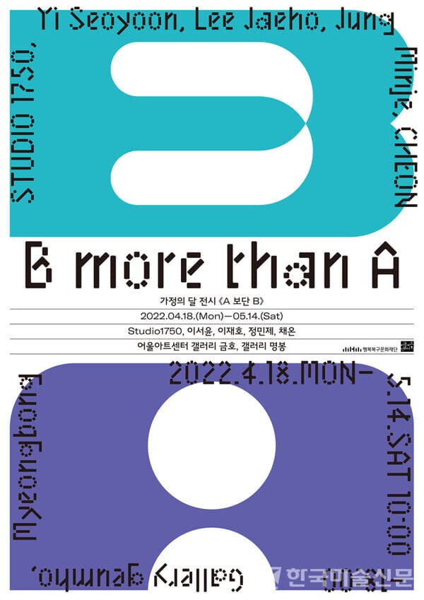
세상의 모든 것들을 이분법적인 사고로 나눌 수 있는 것은 아니지만, 종종 우리는 삶 속에서 쉽게 많은 것들을 흑과 백으로 나눈다. 그사이에는 다양한 채도의 색이 존재하지만, ‘다르다’라는 선을 그어 놓고 편 가르기를 해버리는 일도 부지기수이다. 애초에 영화제작에 있어 예산과 퀄리티, 혹은 장르의 구분에 사용되었던 대문자 A와 B로 표기되는 구분은, 어느 순간 등급 혹은 성적(Grade)의 의미가 반영되었고, 고급과 저급, 주류와 비주류로의 분류에도 사용되기 시작했다.
주술적인 의미로 시작되어, 신화와 종교를 반영하고, 왕족, 귀족 그리고 페트론(Patron)의 후원을 받아 제작되었던 미술은 태생부터 고고한 고급문화에 속했다. 그리고 현재까지도 소위 있는 자, 아는 자들만을 위한 문화로 여겨지며 커다란 대문자 A와 함께 높은 진입장벽을 자랑한다. 그래서 대중들에게 좀 더 친숙하게 다가가면서 일상의 소재 등을 사용한 미술에 대해서는 대문자 B라는 등급을 부여하며 비판해왔다. 그 예로, 헤르만 브로흐(Hermann Broch)는 칸트의 표현을 원용하여 키치를 ‘지극히 속악한 것’이라고 이야기했고, 클레먼트 그린버그(Clement Greenberg)는 키치를 아방가르드의 정반대에 두면서 ‘모방의 모방’이자, 대중예술이라고 일컬었다. 이렇게 오랜 시간 동안 미술의 역사에서 대문자 B로 불린 쉽고 친숙한 미술은 패스트푸드처럼 빠르게 소비(감상)가 가능한 잘못된 아름다움으로 여겨졌다.
하지만 이러한 비난 속에서도 일부는 키치, 팝아트, 네오팝 등 다양한 모습으로 변화 및 발전해 왔고 예술로 인정받았다. 유행이나 취향과 마찬가지로 한 시대의 예술 수용도 변할 수 있는 것이다. 1974년 허버트 J. 갠스(HGebert Gans)가 그의 저서 ‘대중문화와 고급문화’를 통해 이야기하고자 한 대중문화와 고급문화는 단지 '취향'의 차이일 뿐이라는 주장이 인정받게 된 것이다. 현시점에서 전 세계의 미술계를 살펴보아도 대중들은 물론 미술애호가라고 자타공인하는 이들까지도 제프 쿤스(Jeff Koons, b.1955), 야요이 쿠사마(Yayoi Kusama, b.1929), 다카시 무라카미(Takashi Murakami, b.1962), 요시토모 나라(Yoshitomo Nara, b.1959) 등에 열광하고 있으며, 이들의 전시를 유치하고, 작품을 갖고 싶어 한다.
이해하기 쉬운 사람이라고 하여, 생각이 없는 사람이 아니듯 그들의 작품 또한 친숙하고 쉽다고 하여 마냥 가벼운 것은 아니다. 어떠한 이론을 쉽게 풀어 어린아이에게 설명하는 것보다 전문 용어를 사용해가며 어른 혹은 관련 전문가에게 설명하는 것이 더 쉬운 것처럼, 복잡하고 다양한 이론들이 혼재하고 있는 작가의 예술세계를 많은 이들이 친숙함을 느끼고 편안함을 느낄 수 있도록 표현한다는 것이 더 어려운 것이기 때문이다. 이번 ‘A보단 B’에서는 총 다섯 명의 작가들이 익숙한 소재들과 화사한 색채 등의 사용을 통해 다채로운 매력으로 관람객에게 먼저 말을 건넨다.
작가 STUDIO1750는 갤러리 명봉의 공간을 움직이는 설치 작품으로 가득 채웠다. 파랑, 초록, 보라, 빨강 네 가지 조명 속에서 팽창과 수축을 반복하며 움직이는 설치물과 위로 가볍게 올라갔다가 다시 사뿐히 내려오는 부유하는 해파리를 닮은 설치물로 이루어진 공간 속에서 이들의 움직임을 살펴보고 있으면 관람객은 마치 깊은 바닷속에 있는 듯한 착각이 든다. 하지만 이들의 모습은 실제 생명체들의 움직임과는 달리 일률적이고 반복적이다. 그리고 이들을 비추는 강한 색채의 조명이 더해져 공상 과학 영화나 만화에서나 보던 괴생물체가 등장한 것 같은 인상을 준다. 하지만 조금 더 가까이서 살펴보면, 이 생명체들은 우리가 일상생활에서 쉽게 소비하는 비닐을 주 소재로 하고 있다는 것을 알 수 있다. 해양 동물들을 위협하며 바다 오염의 원인이 되는 비닐과 플라스틱이 작가의 손을 거쳐 새로운 생명체가 되어 우리 앞에 다시 나타난 것이다. 이 변종이 다시금 우리에게 해를 입힐지는 알 수 없다. 하지만 환경에 대한 경각심을 불러일으키기에는 충분하다.
대전시실인 갤러리 금호 입구에는 커다란 벽화 작품이 관람객을 맞이한다. 작가 이재호는 커다란 벽면 가득 봄이 한껏 물든 작품을 통해 전시장 밖과 안을 연결했다. 그가 붓으로 구현해낸 화사한 색의 꽃들을 통해 관람객들은 실내에서도 완연한 봄기운을 느낄 수 있다. 의인화된 꽃들도 커다란 눈을 뜨고 반갑다는 듯한 모습으로 관람객들을 맞이한다. 그의 작품 제목인 ‘호야 호야’, ‘호이 호이’는 작가의 이름에서 따온 언어라고 하지만, 마치 꽃들을 눈뜨게 하는 마법 주문처럼 들린다. 그의 마법을 통해 우리는 바쁜 일상에서 지나치지만 했던 꽃의 아름다움을 한 번 더 살펴보고 잠시나마 봄을 만끽해 볼 수 있는 시간을 갖는다. 또한 그의 작품 속 꽃들은 만개하며 절정의 아름다움을 뽐내고 있다. 여기에는 작품을 통해 인생의 가장 화려한 시절이라고 여겨지는 젊음과 이후로는 시들게 될 그 유한함에 관해 이야기하고자 하는 작가의 의도가 숨어있다.
전시실에 들어서면 거대한 화면을 가득 채운 다채로운 색 면, 거친 듯한 색감과 붓 터치가 관람객의 눈을 사로잡는다. 작가 채온은 우리가 일상생활에서 쉽게 만날 수 있는 정물로서의 꽃을 표현했다. 보통 집안 혹은 카페 등 실내에 존재하는 꽃은 잘 정돈되고 배열된 모습으로 자신의 아름다움을 한껏 뽐내며 공간의 한 부분을 차지하고 있다. 하지만 너무나 공간에 잘 스며든 나머지 우리는 때때로 그의 존재 여부를 인지하지 못한다. 그의 작품 속 꽃 또한 배경과 함께 어우러져 뭉개지고 합쳐져 정확히 어떠한 꽃인지 알 수 없다. 심지어 이 식물이 개화를 준비하고 있는지 혹은 시들고 있는지도 명확하게 확인할 수 없다. 그저 그들이 지닌 생명력과 에너지만이 그의 붓놀림 속에서 새로운 꽃의 형태로 재형성되어 폭발하듯 캔버스를 메워낸다. 그의 작품 속에서 꽃은 삶 속 배경이 아닌 하나의 주체가 된다.
전시장 안쪽에는 벚꽃이 지면서 바닥을 수놓듯 흩뿌려진 물감의 패턴이 돋보이는 작가 정민제의 작품이 관람객을 반긴다. 그녀는 우리가 매일매일 사용하는 천과 실 그리고 언어를 소재로 작품을 만들어 낸다. 같은 크기의 화면에 정해진 물감으로 제작되었지만, 작가의 행위를 통해 제각각 새로운 모습으로 표현된 그녀의 패턴들은 주어진 시간 속에서 제각각 새로운 모습을 만들어 내는 우리의 삶과 닮아있다. 언어가 포함된 작품 또한 마찬가지이다. 어릴 적 눈을 찡그리며 숨어있는 이미지나 단어를 찾았던 매직아이 같이 그녀의 작품 속에는 한눈에 잘 들어오는 문자도 있지만 잘 보이지 않는 문자도 있다. 캔버스의 주 배경색과 바느질된 실의 색에 따른 영향일 수도 있지만, 읽는 주체의 차이일 수도 있다. 더 나아가 같은 문자라도 읽는 사람에 따라 다르게 해석할 수 있다. 어떤 이는 그녀의 작품 속 단어 혹은 글을 읽고 웃기도 하겠지만, 다른 누군가는 화를 내기도 혹은 상심에 잠기기도 할 것이다. 작가는 이렇게 작품을 통해 언어의 오류를 이야기한다. 같지만 다름, 그것이 그녀의 작품 속에서 느낄 수 있는 또 다른 같음이다.
전시장의 또 다른 한쪽 편에는 아기자기한 귀여움과 다채로운 색상의 작품들이 동화책처럼 펼쳐져 있다. 추상적인 붓 터치와 함께 구상적인 드로잉이 함께하고 있는 작가 이서윤의 작품 속에서 관람객은 무언가가 의인화된 듯한 눈과 입의 모양들도 찾아볼 수 있다. 적절히 섞인 구상표현과 재미있는 제목들이 상상의 나래를 펼치게 한다. 작품 제목 속의 언어 혹은 단어들은 작품 속에서 이미지로 표현된 듯한 것도 있지만, 이와 관련된 단서를 전혀 찾을 수 없는 것도 있다. 작가는 일상에서 만날 수 있는 문구나 대화 등에서 자신에게 인상 깊게 다가오는 것들을 모으고, 자르고, 붙여 제목으로 완성한다고 한다. 화면 속 이미지들도 마찬가지이다. 관련 없는 하나하나의 이미지들이 모여 한 데 뒤섞인 듯한 느낌을 준다. 그 섞임 속에서 관람객은 자신의 인지가 이미지가 먼저인지 언어가 먼저인지 알 수 없는 딜레마에 빠진다.
이번 전시의 작품들은 일상 속 소재들을 토대로 밝고 통통 튀는 매력을 선보이기에 어쩌면 누군가에게는 대문자 B의 미술로써 친숙하게 다가갈 수 있다. 오히려 대문자 A의 미술보다 이들의 미술이 좀 더 매력적이고 흥미를 불러일으킬 수도 있다. 그리고 이러한 관심이 대문자 B의 미술을 A로, 혹은 대문자 A에만 관심 있던 이들을 B로 이끄는 계기가 될 수도 있다. 물론 이들의 미술은 쉽고 발랄한 색채로 관람객의 눈을 현혹하지만, 단지 장식으로서의 미술의 역할에서 그치지 않고 이를 통해 사회와 현상에 대한 주제 의식을 던지고 있다. 우리가 과거 키치라고 생각했던 것이 모든 시대에 적용되는 최종적 분류가 아니었듯, 오늘날 대문자 B로 불리는 예술이 백 년 전에도 반드시 그러했을 필요는 없으며, 혹은 앞으로 백 년 동안에도 아닐 수도 있다. 관점이 변하면 예술에 대한 평가 역시 변할 수 있는 것이다. 즉, 예술을 표현하고 즐기는데 정답은 없다.
글. 정연진(독립큐레이터, 예술학)
<편집자 주 : 본 미술 평론은 독자들의 작품 이해도를 높이고 미술 정보 전달을 위한 비상업적인 목적입니다. 저작권은 평론가에게 있습니다.>
Not everything in the world can be divided into dichotomous thinking, but often we easily divide many things into black and white in our lives. In between, there are colors of various saturations, but it is not uncommon to draw a line called 'different' and divide the sides. The division marked with capital A and B, which was originally used to classify budget and quality or genre in film production, at some point reflected the meaning of grade or grade, and was classified into high and low, mainstream and non-mainstream. also began to be used.
Art, which began with a shamanistic meaning, reflected mythology and religion, and was produced under the patronage of royalty, aristocrats, and patrons, belonged to a lofty high-class culture from its birth. And even today, it is considered a culture only for those who know and have, and boasts a high entry barrier with a large capital letter A. So, while approaching the public more familiarly, art that uses everyday materials has been criticized by giving a grade of B with a capital letter. For example, Hermann Broch called kitsch 'extremely vulgar' by quoting Kant's expression, and Clement Greenberg placed kitsch in the exact opposite of avant-garde, 'imitation of imitation' and , called popular art. For such a long time, easy and familiar art, called capital B in the history of art, has been regarded as false beauty that can be quickly consumed (appreciated) like fast food.
However, despite such criticism, some of them have changed and developed into various forms such as kitsch, pop art, and neo-pop, and have been recognized as art. Like trends and tastes, the reception of art in an era can change. In 1974, HGebert Gans' claim that popular culture and high culture, which he tried to talk about in his book 'Popular Culture and High Culture', is just a difference in 'taste' was recognized. Looking at the art world around the world at this point, not only the public but also those who claim to be art lovers are Jeff Koons (b.1955), Yayoi Kusama (b.1929), and Takashi Murakami (b.1929). 1962) and Yoshitomo Nara (b.1959), etc., and wants to attract their exhibitions and own their works.
Just as a person who is easy to understand does not mean a person without thoughts, just because their work is familiar and easy does not mean that it is light. Just as it is easier to explain a theory to an adult or related expert using specialized terms than to explain a theory to a child, many people feel familiar and comfortable with the artist's art world, which is a mixture of complex and diverse theories. It's because it's more difficult to express it so that you can feel it. In this 'B rather than A', a total of five artists speak to the audience first with colorful charms through the use of familiar materials and bright colors.
Artist STUDIO1750 filled the space of the gallery Myeongbong with moving installation works. Observing their movements in a space composed of installations that repeat expansion and contraction under the four lights of blue, green, purple, and red, and installations resembling floating jellyfish that lightly rise to the top and then gently descend again, the viewer feels as if I feel like I am in the deep sea. However, their appearance is uniform and repetitive, unlike the movements of real life forms. And the strong color lighting that illuminates them is added to give the impression that a monster creature that has only been seen in science fiction movies or cartoons has appeared. However, if you look a little closer, you can see that these creatures use vinyl, which we easily consume in our daily lives, as their main material. Vinyl and plastic, which threaten marine animals and cause pollution of the sea, reappeared before us as new creatures through the hands of the artist. Whether this strain will ever harm us again is unknown. However, it is enough to raise awareness about the environment.
At the entrance of Gallery Geumho, the exhibition hall, a large mural welcomes visitors. Artist Lee Jae-ho connects the inside and outside of the exhibition hall through works of spring that fill the large walls. Through the brightly colored flowers he has embodied with his brush, visitors can feel the spring vibes even indoors. The anthropomorphic flowers also open their big eyes and greet visitors with a happy look. The titles of his works, 'Hoya Hoya' and 'Hoi Hoi', are said to be words derived from the artist's name, but they sound like a magic spell that opens the eyes of flowers. Through his magic, we have time to take a look at the beauty of flowers, which we have overlooked in our busy daily lives, and enjoy spring for a while. Also, the flowers in his works are in full bloom, showing off their peak beauty. Here lies the artist's intention to talk about youth, which is considered the most splendid period of life, and the finiteness that will wither after that through the work.
Upon entering the exhibition room, the colorful colors filling the huge screen, rough colors and brush strokes catch the eyes of the visitors. Artist Chae On expressed flowers as still lifes that we can easily encounter in our daily lives. Flowers, which usually exist indoors, such as houses or cafes, take up a part of the space by showing off their beauty to the fullest in a well-arranged and arranged appearance. However, it permeates the space so well that sometimes we are unaware of its existence. The flowers in his work are also crushed and combined with the background, so it is impossible to know exactly what kind of flower it is. It is not even clear whether the plant is preparing to bloom or is dying. Only the vitality and energy they possess are reformed in the form of a new flower in his brush strokes, filling the canvas as if exploding. In his works, flowers become a subject rather than a background in life.
Inside the exhibition hall, as the cherry blossoms fall, the work of artist Jung Min-je, with a pattern of paint scattered as if embroidering the floor, welcomes visitors. She creates works of art using the fabric, thread, and language we use every day. Her patterns, which were produced with fixed paint on the same size screen, but each expressed in a new look through the artist's actions, resemble our lives in which each new look is created in a given time. The same goes for works involving language. Like Magic Eye, who squinted her eyes as a child to find hidden images or words, her works contain characters that are easy to see at a glance, but also characters that are difficult to see. It may be the effect of the main background color of the canvas and the color of the stitched thread, but it may also be the difference in the reading subject. Furthermore, even the same character can be interpreted differently depending on the reader. Some will read the words or writings in her work and laugh, but others will be angry or heartbroken. In this way, the artist talks about the error of language through the work. Same but different, that is another sameness that can be felt in her works.
On the other side of the exhibition hall, cute and colorful works are spread out like a fairy tale book. In Lee Seo-yoon's work, which is accompanied by abstract brush strokes and figurative drawings, viewers can also find the shapes of eyes and mouths that seem to be anthropomorphic. Appropriately mixed figurative expressions and interesting titles allow the imagination to unfold. Some of the language or words in the titles of the works seem to be expressed as images in the works, but there are others for which no clues related to them can be found. The artist says that she collects, cuts, and pastes things that impress her from everyday phrases and conversations, and completes them with titles. The same goes for the images on the screen. It gives the impression that unrelated images are gathered one by one and mixed together. In that mixture, the viewer falls into a dilemma of not knowing whether his or her perception comes first with image or language.
The works in this exhibition present a bright and bouncy charm based on everyday materials, so they can be familiar to someone as art with a capital letter B. Rather, their art may be more attractive and interesting than the art of capital A. And this interest may be an opportunity to lead the art of capital B to A, or those who were only interested in capital A to B. Of course, their art dazzles the eyes of the audience with its easy and lively colors, but it does not stop at the role of art as a mere decoration, and through it, it throws a theme consciousness about society and the phenomenon. Just as what we thought of as kitsch in the past was not the definitive category for all ages, the art that today has a capital B need not necessarily have been the case a hundred years ago, or perhaps not for a hundred years to come. If the perspective changes, the evaluation of art can also change. In other words, there is no right answer to express and enjoy art.
[번역=한국미술신문]